
Design Direction
Maison Margiela Residences
The brand-direction study behind Maison Margiela's first branded residences in Dubai: translating the house's fashion codes into a residential material and fixture language for BARNES Dubai.
The brief
Why it exists.
Maison Margiela's residential debut in Dubai needed an interior language that read as the house, not a runway pastiche of it. The brief started from the Maison's own fashion codes, visible construction, exposed seams, fractured and distressed surfaces, industrial materiality, and asked what each one becomes when the canvas is a home instead of a garment.
The result is a working mood board: a four-color palette pulled from the brand's own archive and campaign imagery, a fifteen-piece material library spanning raw metal to bouclé, and a set of "Inspiration → Brand → Material → Fixture" studies that trace a single design idea, visible stitching, for example, from a jacket cuff to a residential door-number plate.
The principle
The argument.
Translate the codes, not the runway: exposed construction, distressed surfaces, and industrial materiality become the residence's actual material and fixture choices, argued one motif at a time rather than dressed on top as branding.
The calls
What the direction refuses to do.
01
The palette is a texture argument, not a colour one
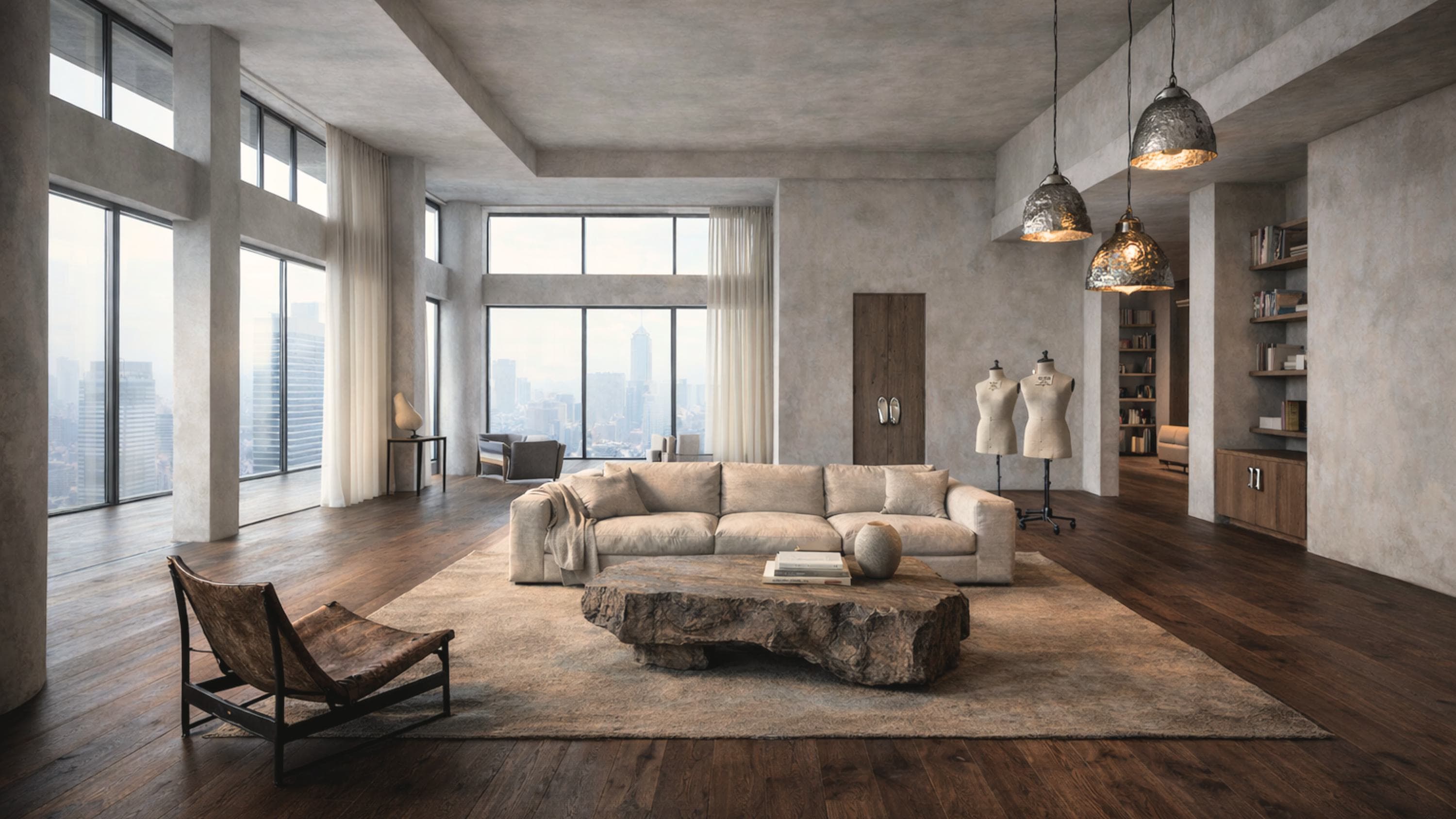
Electric Blue sits in the archive palette and appears in almost none of the rooms. The interiors run plaster, bone and oatmeal against dark reclaimed wood, and what carries them is the collision of smooth against raw: a live-edge stone slab in a room of soft upholstery, weathered leather beside new linen, hammered metal against flat plaster. Reaching for the brand's loudest colour would have been the easy way to make a room read as Margiela, and it would have read as a logo. Holding the palette almost silent forces the house's codes to arrive through material instead, which is where they live in the clothes.
02
One literal signature, placed as an object
Dressmaker's mannequins are the only unambiguous fashion-house reference allowed into the interiors, and they stand in the room as furniture rather than as display. A residence that quoted the runway repeatedly would have become a themed apartment, which is the failure mode of every branded-residence project. One quotation, used sparingly and treated as an object somebody lives with, does the identifying work that a dozen would have undermined.
03
Each motif is traced to a fixture, or it does not ship
The deck's spine is a set of Inspiration to Brand to Material to Fixture studies: a single idea, visible stitching, followed from a jacket cuff through to a residential door-number plate. That chain is the discipline. A code that cannot be followed to something a resident actually touches is decoration and gets cut, which is what keeps a fifteen-piece material library from becoming a mood board with no consequences.
The deck
Spreads from the study.
6 spreads
01Brand research: archive, palette, and provenance 02Early interior concepts: entry sequence and stairwell 03Concept sweep: reception, dressing room, kitchen, stair 04The material library, fifteen finishes 05One motif traced from cuff to door plate 06Applied concept: numbered directory signage
Outcome
Where it landed.
One campaign, two surfaces: the material and fixture language argued here is what the launch film then puts in motion, so the mood board is the campaign's argument rather than preparation for it. Both shipped under BARNES Dubai; the finished film is on Creative → Generative.