
Design Direction
Avanhard
An editorial site telling the history of FC Metalist Kharkiv in five eras, built as a personal design project. Not affiliated with the club, and not an official product: an exercise in whether a 95-year archive of borrowed photographs can be made to feel like one publication.
The brief
Why it exists.
The name is the argument in miniature. The club ran through four names before Metalist, and one of them was Avanhard, which is also the Ukrainian for avant-garde, the visual language the site borrows from. One word that is simultaneously historically accurate and a statement of position is worth more than a logo.
The material is the hard part. Ninety-five years of photographs by dozens of people, some public domain, some Creative Commons, shot on wildly different stock in wildly different conditions, from a 1927 construction site to a 2022 photograph of sandbagged artwork in a bombarded city. Left alone they look like a page of search results. The job was making them read as one publication without pretending they came from one.
The principle
The argument.
One ground, one voice, and every borrowed thing credited in the open: an archive becomes a publication when the treatment is consistent enough to disappear and the sourcing is honest enough to print.
The calls
What the direction refuses to do.
01
Set it in the country's own typeface
The display face is e-Ukraine, commissioned by Ukraine's Ministry of Digital Transformation and released under an open licence. A site about a Ukrainian club could have used any confident grotesque and looked fine; using the one the country made for itself means the typography is already saying something before a word is read, and it comes with a licence that permits the use rather than a font file of uncertain provenance. It is self-hosted, as is everything else, so no third party is told who is reading.
02
Everything goes monochrome, so the archive stops arguing with itself
Every photograph is desaturated onto the same warm paper. That is a real loss: the later colour material had life in it, and the club's own yellow and blue disappear from its own history. What it buys is a sequence where a 1927 construction site and a 2022 news photograph belong to the same object, and the eye reads the story rather than the film stock. Colour is then spent deliberately, in two places only, and both are about the crest.
03
Show where the crest comes from, rather than asserting it
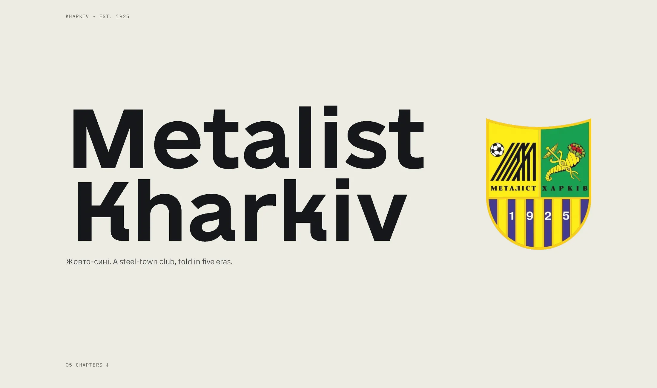
The archive opens with three marks side by side: Kharkiv's municipal arms, the club emblem of the 1990s, and the crest in use today, captioned with exactly what is quoted from what. The caduceus and cornucopia are named as borrowings from the city's arms; today's crest is described as city arms on one side and the works-team monogram on the other. It is a small piece of design scholarship, and it does more for the reader's trust than any amount of assertion about heritage.
04
Break the grid once, for the thing that deserves it
Four eras sit as light cards in a two-column grid. The fifth, the club's best years, is pulled out of chronological order to close the sequence as a full-bleed dark card, white type over a floodlit stadium. It is the only card that breaks the pattern and the only one carrying the yellow label, which is also the one place the token system permits that colour: it is legible on dark and nowhere else. The exception and the rule that allows it were designed together.
05
The credit line is set, not hidden
Each image carries its photographer, date and licence in mono directly beneath it, in the composition rather than in a colophon nobody opens, and Ukrainian photographers keep their names in Cyrillic rather than being transliterated for an English reader's convenience. Borrowed work is the entire substance here, so the sourcing is typeset as content, with a full ledger behind it naming every file, source and licence, including the one asset that is not freely licensed.
The deck
Spreads from the study.
3 spreads
01The archive: crest provenance, then five eras, the last breaking the grid 02The token system, with legibility written into the palette 03The colophon, including the one asset that is not freely licensed
Outcome
Where it landed.
A five-chapter editorial site with an internal style guide and a full public ledger of every borrowed asset, built to find out whether an archive can be given one voice without flattening what is in it. Personal work, unaffiliated with the club, which is exactly why the licensing is as designed as the typography.